At this moment we’re building the first version of Mbassador. I’m so excited about this first version. Can’t wait to test and use the product.

About 6 weeks ago we decided to pivot the visual design. Although we were very enthusiastic about this ‘previous’ design, there were very good reasons to change it. A different design approach to make it a better fit.
App feeling
One of the main differences of Mbassador to other competitors (like Path) is the App approach. In short: we want to be the Evernote of your moments and thoughts. A tool to log, secure and save all of your precious moments. That’s why we chose an application feeling over a social medium feeling. It should be more like Google Drive than Facebook.
This previous design was way to ‘Social Media’. To much focus on the perfect profile and social sharing.
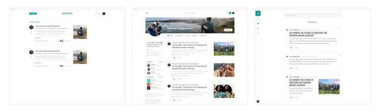
Too designy
Also, the moments, journeys and profile feel to perfect. In our mission statement we have the sentence: “Embrace imperfection”. We don’t want people to make their moments too perfect. To give the impression people have to marketing their moments. We like it Raw, authentic and imperfect. Let people create their own magic. The design should support this feeling.
So, we made the design more supportive and secondary to the content. We made the pages more app style and less social. The new and current visual design looks maybe less spectacular at this moment. But we are convinced this design supports the way Mbassador works the best.
To quote Steve Jobs:
“Most people make the mistake of thinking design is what it looks like. People think it’s this veneer – that the designers are handed this box and told, “Make it look good!” That’s not what we think design is. It’s not just what it looks like and feels like. Design is how it works.”
