
Over the past view weeks, we’ve been working very hard on a new Mindwave release. It’s live, and it feels so damn good. I really think we took it to the next level here. We’re getting ready for Mindwave 2.0.
Improve the User Experience
In this release (release 1.7!) we want to take our Branding, the Look & Feel, and the User Interface to the next level. Not that Mindwave looked bad, not at all. But it wasn’t energetic, fun and exciting for daily usage. Someone even compared our colors (gray, white, purple) with a funeral service provider (thnx, @raymond).
So, to document the progress (and for future entertainment 😉 ??
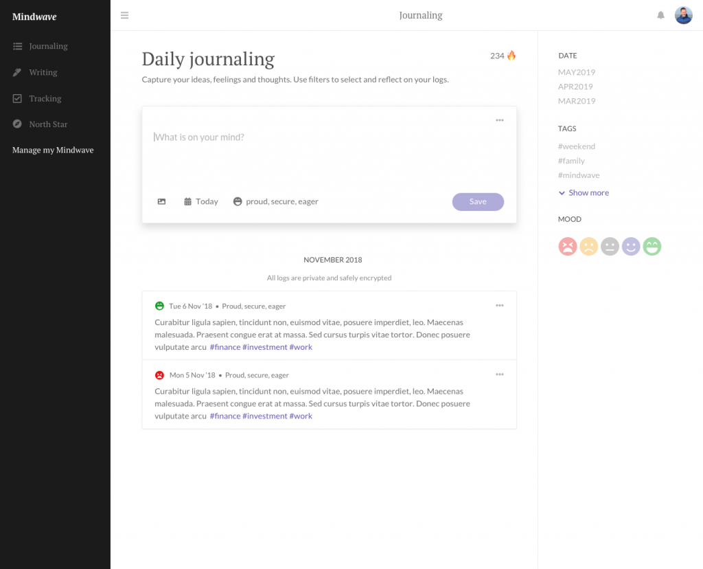
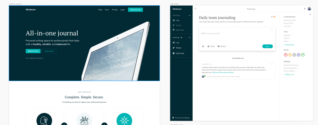
The old Mindwave
This is what the old Mindwave.app looked like, November 2019.
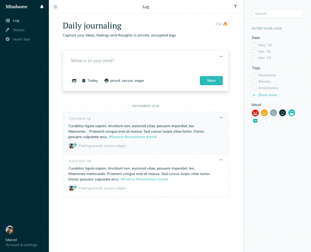
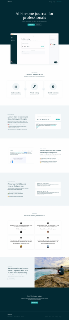
The new Mindwave
This is what the new Mindwave.app looks like, December 2019.
The design process
So how did we actually get to that second version?
First, we (mainly @Martijn) started designing a new Homepage Header in Sketch. Should we go with an illustration, should we show our product on an iPad, should we go for an image. We tested different ideas, styles, fonts, and eventually colors.
Illustration test
Brand colors test
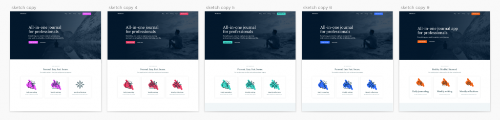
We shared some Work in Progress on Twitter and in the Mindwave Telegram Group for feedback and ideas. Many, many, many versions folowed. At one point we were quite happy to go with (dark)green. It just felt right.
As I wondered what the app would look like in this new style, I copied the Mindwave log page from an older Sketch file and changed all colors myself.
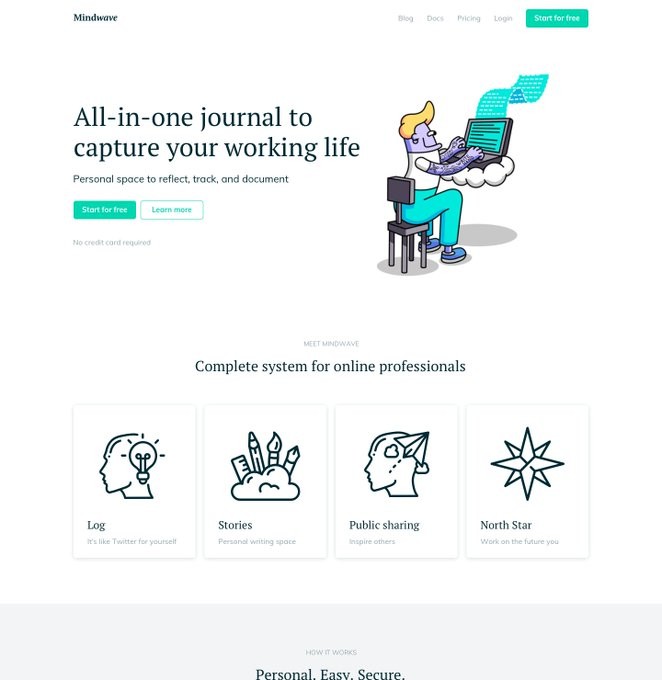
Homepage + app in final colors
This is definitely going into an awesome direction.
Interface issues
We collected quite some user feedback over the past weeks/months and we wanted to solve the top-5 issues:
- Filtering your entrees isn’t intuitive.
- The sidebar functionality isn’t clear (especially on mobile).
- What, No Auto-save? That’s a deal-breaker!
- User onboarding is not really well executed.
- Search in logs and stories.
So, we did! Of course, we have to wait for user feedback to compare versions. But first user feedback and activity looks promising.
Homepage
Then the homepage got a makeover. We tried to solve most first visitor questions: what is it, how does it work, why should I, what are the benefits, for who is it, what do I get, and where do I start?
Ready for Mindwave 2.0
To get back in that “we’re getting ready for Mindwave 2.0”. Obviously this new user interface is a big step forward. But at the same time we made some huge progress as a product as well. It is much more clear what Mindwave is. Plus, the current version is quite complete. It all works bug-free, and we fine-tuned the details.
Looking back at this year, we released the Alpha in March ’19, we shipped the beta in May ’19 and (accidentally) launched on ProductHunt in July ’19. That is 5 months ago!
I’m really, really proud of the progress we’ve made. Damn.
Looking forward, we are just one release away to call Mindwave,
The all-in-one journal for professionals & teams.
I’m ready for 2020. Ready for 2.0.
